How to Make Form Handling Easier in React (validation, styling)
Learn how to easily handle forms in React using @systatum/coneto. This guide shows how to simplify validation, error handling, and state management with reusable components for faster and cleaner form development.

Alim Naufal
Nov 03, 2025
In this post, I’ll show you about how to made easier when you handle form on React JS — Including to handle the error, can hidden, can validation, multi input rows, and more. You can achieve all of this just with one library, and it feels as simple as you craft some puzzle, you just need to add:
- The fields your form needs (
fields) - Your form state (
formValues) - Your validation schema (
validationSchema) - A Callback
schemawhen your contentisValid(onValidityChange) - Your set the callback with Callback
value(onChange) - Optional: can autofocus for one field if you want (
autoFocusField)
So, what’s the library to makes this possible?
The answer is @systatum/coneto , this is actually part of my real-world case project to reusable component that helps you build web application when using react. You can explore more any example at coneto.systatum.com
So this is step by step to do craft your form:
-
Install the library
@systatum/conetoin your environtment:with npm:
npm install --save-dev @systatum/conetoor with pnpm:
pnpm add -D @systatum/coneto -
Initialize Your State
Add your value as usual (you can using React's
useStateor any state management library):const [value, setValue] = useState({ first_name: "", last_name: "", email: "", phone: "", note: "", access: false, country_code: DEFAULT_COUNTRY_CODES, }); -
Define Your Fields
Let’s add the
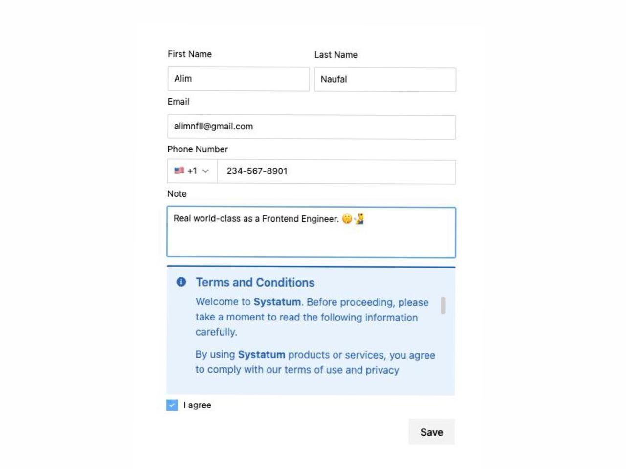
form-fieldsas simple array like on the example, even you can add with any array to make them in one row:const EMPLOYEE_FIELDS: FormFieldGroup[] = [ [ { name: "first_name", title: "First Name", type: "text", required: true, placeholder: "Enter first name", }, { name: "last_name", title: "Last Name", type: "text", required: false, placeholder: "Enter last name", }, ], { name: "email", title: "Email", type: "email", required: true, placeholder: "Enter email address", }, { name: "phone", title: "Phone Number", type: "phone", required: false, placeholder: "Enter phone number", }, { name: "note", title: "Note", type: "textarea", rows: 3, required: false, placeholder: "Add additional notes", }, { name: "custom", type: "custom", render: ( <Messagebox variant="primary" title="Terms and Conditions"> <ScrollBox> <span> Welcome to <strong>Systatum</strong>. Before proceeding, please take a moment to read the following information carefully. </span> <span> By using <strong>Systatum</strong> products or services, you agree to comply with our terms of use and privacy policies. These guidelines are designed to ensure a consistent and secure experience for all users within the <strong>Systatum</strong>{" "} ecosystem. </span> <span> The <strong>Systatum</strong> platform may update its features, security policies, or user interface without prior notice. We encourage you to review these updates regularly to stay informed about the latest improvements. </span> <span> Your data and privacy are important to <strong>Systatum</strong>. We use industry-standard security measures to protect your information and maintain compliance with global data protection regulations. </span> <span> If you have any questions, feedback, or require further assistance, please contact the <strong>Systatum</strong> support team. We’re here to help ensure you have the best experience possible. </span> </ScrollBox> </Messagebox> ), }, { name: "access", title: "I agree", type: "checkbox", required: true, }, ];If you’re wondering, where are from the type of
FormFieldGroup, actually this is comes from the same source:import { FormFieldProps, StatefulForm, StatefulOnChangeType, } from "@systatum/coneto/stateful-form"; -
You should need to add the schema on the component:
This is using
zodfor schema validation:const employeeSchema = z.object({ first_name: z .string() .min(3, "First name must be at least 3 characters long"), middle_name: z .string() .min(3, "Middle name must be at least 3 characters long"), last_name: z.string().optional(), email: z.string().email("Please enter a valid email address"), phone: z .string() .regex(/^\d{10,15}$/, "Phone number must be between 10 and 15 digits") .optional(), note: z.string().optional(), access: z.boolean().refine((val) => val === true, { message: "Access must be true", }), }); -
Put it all together
Finally, this is the last step to render your form:
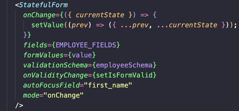
<StatefulForm
  onChange={({ currentState }) => {
    setValue((prev) => ({
      ...prev,
      ...currentState,
    }));
  }}
  fields={EMPLOYEE_FIELDS}
  formValues={value}
  validationSchema={employeeSchema}
  onValidityChange={setIsFormValid}
  autoFocusField="first_name"
  mode="onChange"
/>
And that’s it — you’ve built a fully functional, validated, and dynamic form with just a few lines of code!